2/7/11
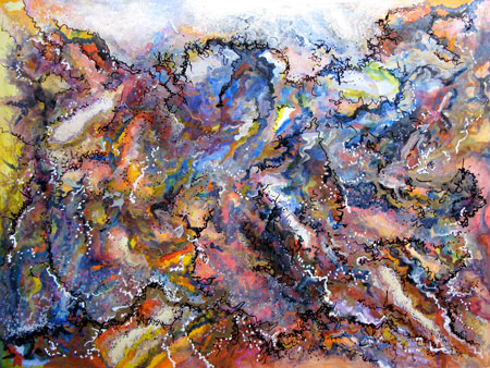
This is the painting started in Sylvia Megerdichian’s class. She talked about working with light using a mid-value then moving to dark. “You cannot paint like anyone else. When you paint like you, your best comes out.”
Painting My Emotions #1
If you want to paint as an outlet, my first video may help you get started:
http://www.youtube.com/user/GraceDesignArt?feature=mhum#p/a/u/0/vQvqp-IrrqE
Even The Library Isn’t Free
Last week I went to my new local library to check out a couple books, yoga DVDs, and two books on CDs. The woman behind the desk said, “That’ll be $7.” Never before did I pay for anything at the library (except late fees). The library is the only free institution I have known since a child and even as an adult, it is one of my favorite places to be. All that learning going on and free resources at our fingertips. Yum. So what’s this all about, charging me to learn, when thousands of other resources offer FREE products and services? Free business cards at Vista print. Free websites at WordPress.com. Free news articles written by trained writers who are convinced to give their work away for free for “great exposure.” Especially in my field, people still ask me to do work for free. “It won’t take you long to crop four photos.” “Do my logo and I’ll market you.” “Let’s barter services.” What’s peculiar is many do graphic design themselves. It’s a DIY “Do It Yourself” society. Yet, when will we be making enough money to hire the experts? Expecting everything for free can’t continue. Sure you can give away a taste of what you do but you need to be paid. The pendulum is swinging backwards and my new library also expects to be paid. Not sure if I’ll be borrowing DVDs at $2 a piece. I sure hope to make enough to hire a copy editor someday.
Logo Redesign and Postcard
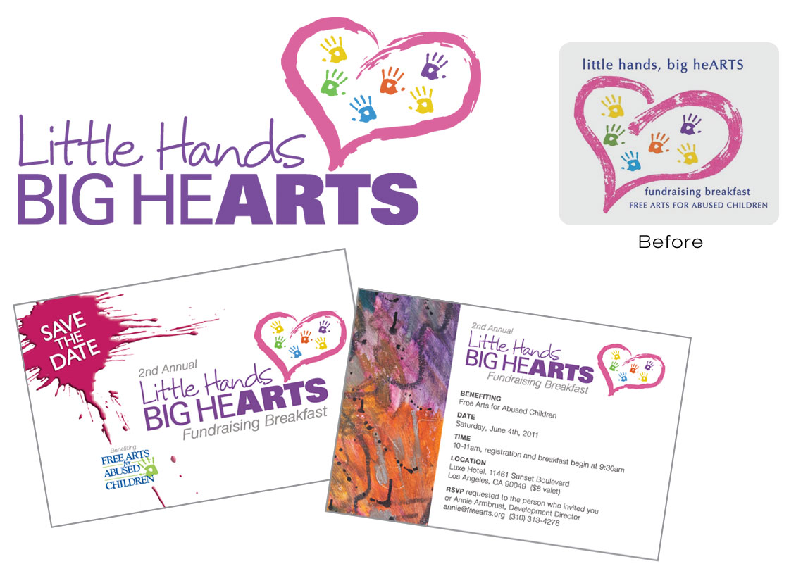
Free Arts for Abused Children contacted me to spruce up their existing fundraiser logo and design a “save the date” postcard. They wanted to use the same heart graphic and hand prints from their original logo, although, the original graphic was not available. I had to recreate the heart in Illustrator and add the hand prints in various colors to match it as close as possible. For “little hands,” I selected a handwritten font to give a youthful, warm feeling. The “big hearts” text in all caps blended well with “ARTS,” which stood out in a much bolder font. When designing the postcard, I thought a paint splash would be a great graphic to place behind the “Save the Date” text. Also, instead of using text for “Free Arts for Abused Children” (as on their last postcard) I used their official logo for brand recognition and placed it along a paint drip to direct your eye towards it. A student’s artwork was used for the back of the card and the colors in the art brought out the colors in the logo and heart graphic, bringing a cohesive look to the direct mail piece.
 This organization delivers the healing power of art to abused, homeless, and at-risk children. For more information, visit: http://www.freearts.org
Catching Up
The end of the year was spent packing up my 675 ft. sq. apt, moving to a new view, and finding a new walking/running companion. Clue, a Corgi Ikea rescue dog, took some firm patience to train. We spend about an hour every day on the path near our home with mountain views in all directions. He still gets out of control when another dog is near yet he’s improving.
After the first of the year, I began networking for graphic design work. A few potential clients ask me to quote their projects. One decided to do the work herself in Corel Draw. The other is not sure his conference will happen. Another one wanted her project pro bono. I have done so much free work over the years, I won’t do that anymore. She asked what it would cost, I gave her a great deal and got the project. Good clients are out there and I will find them.
Two minutes from our home, I discovered the Chaffey Community Art Association and became a member immediately. Already volunteered as a greeter for an event. Painting has fallen out of my routine, though. I plan on writing my first book all day. It’s already lunchtime and only one paragraph has been written. For some reason, I needed to post this. It’s been too long since my last post.
Automatism
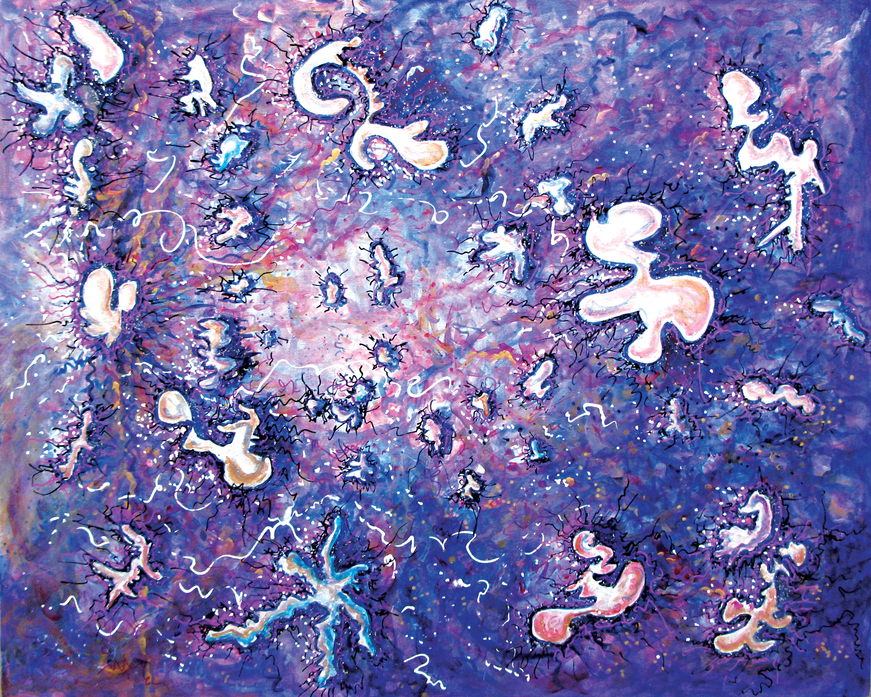
Pictorial free association, Automatism as defined in “Art Speak,” was the last project from the abstract class at UCLA with Ben Britton. Using Payne’s Grey, I started drawing outlines of these shapes. They are some sort of entities that have been showing up in my work, similar to Gatherers and The Rose Angel. In this painting, the entities are traveling west, following the leader on the center left side. They are coming together under one mission: healing.
One Stroke Marks
For project #2 from UCLA abstract painting class, we started with an exercise in class taking turns repeating marks made by another student. For our painting, we were to use one stroke gestures or marks and also consider using motifs or patterns. My main thought while painting was to use strokes in different sizes, wiping away areas and adding more color.
Columbus Day 10/11/10
I need to work on my painting some more. It’s at the ugly stage. Not sure how I’m going to fix it. I haven’t been writing much or doing my own work since I started the UCLA class. The painting is getting worse. Maybe that’s a good sign. The painting is still muddy. Too many areas have the blue and orange blended together. I kept laying on more strokes of color. Class critique is tonight.
Invisible Gestures
Infinity
9/21/10
Spur of the moment abstract art class was good last night.
Layer 3 looks done but I kept painting. Notes from class: flat planes that overlap value, interlocking, come up in stages, same depth, contrast, edges, relationships between forms, edges: sharp or painterly, balance, sense of gravity, look for opportunities to define a space between forms, organizing principles. The final touches were the white, black and gold lines. The symbol Pi appeared and that means infinity to me. Ben, the instructor at UCLA, thought this painting looked like a Celestial Block Party. So maybe that’s what happens when we die. Forever more, we are in party mode with all our good friends.
825 Gallery on La Cienega
9/22/10
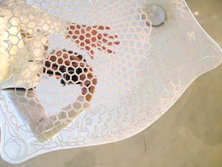
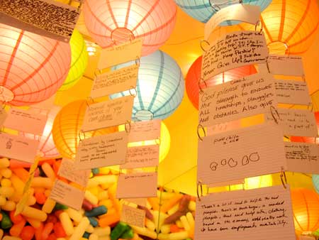
Stopped in 825 Gallery on La Cienega in W. Hollywood and I was impressed. It reminded me of the Ecstasy: In and About Altered States exhibit at the MOCA in 2005. The first photo shows laced mirrors hanging from the ceiling. Different sizes at different heights were hung around the room. The reflections were beautiful. The second photo is of the exhibit that asked people at the opening to write on postcards what they needed most in life. The colorful balloon lights held the postcards as they were assembled that night. A great exhibit to experience on your own. Sensations may vary.
