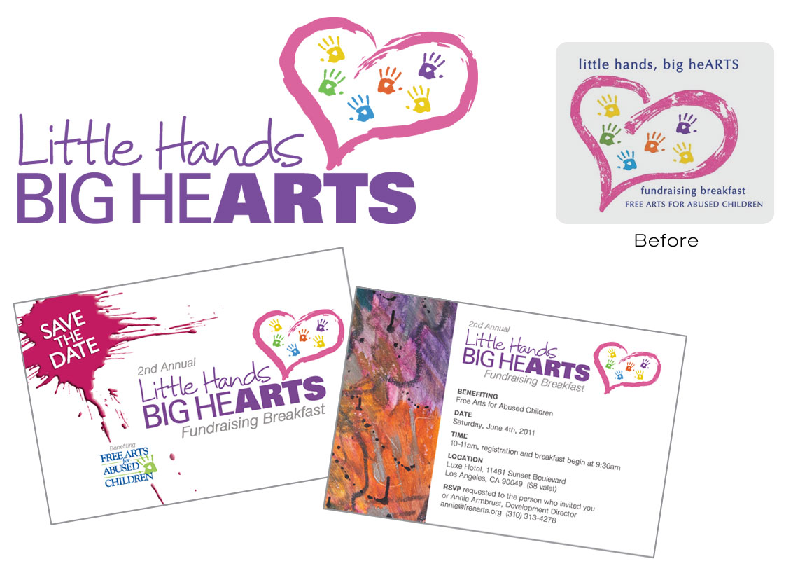
Free Arts for Abused Children contacted me to spruce up their existing fundraiser logo and design a “save the date” postcard. They wanted to use the same heart graphic and hand prints from their original logo, although, the original graphic was not available. I had to recreate the heart in Illustrator and add the hand prints in various colors to match it as close as possible. For “little hands,” I selected a handwritten font to give a youthful, warm feeling. The “big hearts” text in all caps blended well with “ARTS,” which stood out in a much bolder font. When designing the postcard, I thought a paint splash would be a great graphic to place behind the “Save the Date” text. Also, instead of using text for “Free Arts for Abused Children” (as on their last postcard) I used their official logo for brand recognition and placed it along a paint drip to direct your eye towards it. A student’s artwork was used for the back of the card and the colors in the art brought out the colors in the logo and heart graphic, bringing a cohesive look to the direct mail piece.
 This organization delivers the healing power of art to abused, homeless, and at-risk children. For more information, visit: http://www.freearts.org
